Start with what holds your attention
Choosing a photograph can begin before a decision about paper size or a frame. Look at what keeps drawing you back: a patch of color, a shape, a stretch of open space or a small detail. Comparing color and black-and-white work can help you name that preference without deciding that one approach is always better.
The photographs here offer specific examples. They are different scenes, not color and monochrome versions of the same image. Each can be considered on its own terms.
Notice how color gathers attention
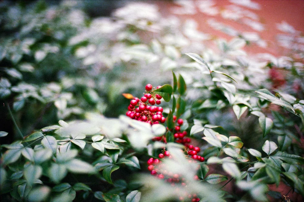
In Red Berries in Green Foliage, small red berries sit among overlapping green leaves. Some leaves are sharper; others soften around the berries. Try following the red areas first, then look again at the green shapes surrounding them. The subject includes both the cluster and the space around it.
Curving Coastline offers a different color arrangement. Blue water and sky occupy broad areas, while a pale shoreline and beachfront buildings trace one side. Compare the open view with the denser berry photograph. Your preference might be for that sense of space, the smaller detail, or the way each photograph holds both.
Follow light, dark and repeated shapes
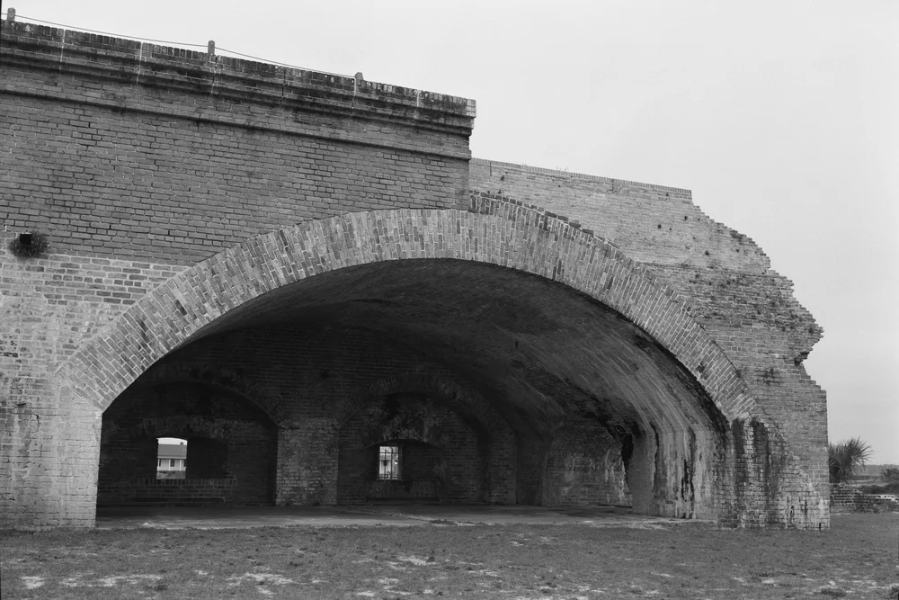
In Archway, the broad curve of brick sits above dark openings. Straight brick courses meet the arch, and the lighter upper wall contrasts with the shadow beneath it. Look at the large shape first, then the smaller marks and changes across its surface.
Passage uses another arrangement: ceiling beams repeat toward a bright wall, with darker floor and foreground areas below them. Follow one beam into the distance, then notice how the bright wall interrupts the darker space. These are observations about the photographs, rather than a rule that all black-and-white work must be dramatic or architectural.
Compare complete photographs
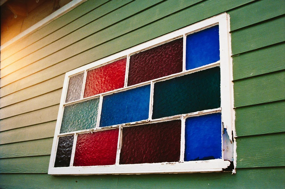
View the whole image before deciding which detail matters most. In Colored Glass Window, the colored panes are surrounded by green siding, a white frame and a warm area of light near one edge. Those surroundings belong to the photograph too. A tight preview of the glass alone would leave them out.
When considering two photographs together, start with a connection you can actually see: repeated rectangles, a strong curve, a similar amount of open space or a contrast between dense and sparse detail. You do not need to make every color match. The useful question is whether you enjoy looking between the images.
Return to the work you want to keep looking at
Make a small shortlist and revisit it later. Note the photograph title and the feature that interested you, then compare it with the full image again. This keeps the choice connected to the work rather than to a label such as coastal, botanical or monochrome.
Explore the botanical, coastal and Monochrome Architecture collections, or view Archway and Passage individually. Print availability is pending and online ordering is not yet open. If a photograph stays with you, use the inquiry form and include its title. The separate print-size guide explains proportions and borders when you are ready to consider presentation.
